


Article
How to Add Editable Areas to Exported MailChimp Templates
If you’ve tried recently exporting a MailChimp template you’ve been greeted with this alert. It’s...

Aug 15, 20142 min Read
Continue Reading

In case you haven’t noticed, mobile is all the rage. And if you haven’t figured it out by now, it’s not a trend. People use their phones more than they use desktop computers. It’s not hard to figure out why. People have phones with them wherever they are, and the phones do most things a desktop computer can do. When it comes to using the internet, mobile devices sometimes even do it better.
This is clearly the best time in history to be a mobile device. As a mobile device, you are the center of attention. Everything is being designed specifically for you. More people own you than own a toothbrush (supposedly). Google thinks you are the most important thing since sliced bread. No, you are much more important than sliced bread ever was. You are the present and the future (until a smaller, more powerful device comes and replaces you).
In light of the above, many web designers have taken to the “mobile-first” approach. They’ve adopted it as a primary part of their process. They create and show you mobile layouts before they show you what the desktop site will look like.
Business owners might find this approach a bit underwhelming at first. After all, it’s much more impressive to pull up that brand new website on your giant projection screen than it is to see it on a little 5-inch device. But web design isn’t just about impressing people, is it?
Last year, Google announced that the majority of searches occurred on mobile devices. Data shows that people spend significantly more time on their mobile devices than with any other technology. Many people have turned into multiple-device users; they can’t even watch TV without looking at their phone.
This sounds like a golden business opportunity. Of course you want to design for mobile first, right? Especially now that Google says its search results are shifting to mobile. That’s right. Google is now putting more weight on the mobile version than your full website. Moving forward, you’ll be judged solely on what your mobile site looks like. Add in the fact that your mobile site allows you to reach everyone everywhere and always, and it seems like this mobile-first approach is a no-brainer.
But does any of this really mean that your website should be designed for mobile first?
As with almost everything else in the world, it depends.
If you’ve been smart, this mobile-first thing actually won’t affect you at all. Hopefully, you already have a responsive website. It’s the best way to future-proof your web presence for all devices. Even Google gives it two thumbs up. If your website is responsive (and built correctly), then you’re already meeting the mobile-first requirements.
But even if your site is already mobile-friendly, you’re going to need a new one sooner than later. When it comes time to redesign that site, are you going to tell your designer to show you the mobile version first and then scale up to desktop? That’s surely the opposite of what you did last time around. But times are a changin’, and you don’t want to get caught in the past.
Don’t take that mobile-first plunge just yet. At least not blindly. A mobile-first approach doesn’t make sense for every company. No matter what stats you hear, there are still many industries where the vast majority of users come from desktop. There are also a lot of people who won’t buy stuff using their mobile phones. Sure, they’ll look, but they won’t actually convert until they can get to a full computer.
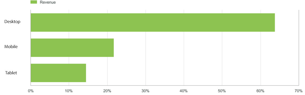
It doesn’t matter that over 50% of Google searches occur on mobile phones. Your business isn’t Google. If 75% of your users visit your site from desktop, you clearly don’t want to put the focus on mobile. If 80% of sales and leads come from non-mobile devices, you aren’t going to design with all your emphasis on the mobile experience. But you don’t want to ignore mobile either.
A great responsive website isn’t about making a desktop website that merely shrinks down as the device gets smaller. It’s about creating an experience that works the way you want it to no matter what device your visitor is using. Your mobile user shouldn’t miss out on half the functionality or half the content just because their screen is smaller. Nor should your desktop user be presented with a really big version of a mobile website.
Part of successful web design is about finding the right balance. You are never designing for one particular situation. You have different audiences, different technologies, different goals. You have to create a website that hits all of them. Whether you choose to design for mobile first or desktop first doesn’t matter. What matters is that you create an experience on all devices that’s going to be meaningful for your customers.
Don’t forsake the desktop experience just because everyone is going mobile. Your website needs to be great on all devices so you can maximize your ROI no matter how big someone’s screen is. The best web designers won’t be mobile first or desktop first. They’ll be goals first.
If you want your next website designed to exceed your business goals on any device, contact us today.
Nate Tower is the President of Perrill and has over 12 years of marketing and sales experience. During his career in digital marketing, Nate has demonstrated exceptional skills in strategic planning, creative ideation and execution. Nate's academic background includes a B.A. with a double major in English Language and Literature, Secondary Education, and a minor in Creative Writing from Washington University. He further expanded his expertise by completing the MBA Essentials program at Carlson Executive Education, University of Minnesota.
Nate holds multiple certifications from HubSpot and Google including Sales Hub Enterprise Implementation, Google Analytics for Power Users and Google Analytics 4. His unique blend of creative and analytical skills positions him as a leader in both the marketing and creative worlds. This, coupled with his passion for learning and educating, lends him the ability to make the complex accessible and the perplexing clear.

