


Article
5 Content Mistakes You’re Making On Your Website
Whether content is king, queen, or something else entirely these days, one thing is definitely...

Apr 26, 20167 min Read
Continue Reading

Web design is about a lot more than visual appeal. Pretty pictures and charming colors would be enough if websites were simply meant to be seen and observed – but this is not the case. Websites are meant to be used and interacted with to impart information, deliver products or services, or put users on the right path to accomplishing a goal.
Because of this, web design brings with it a number of rules and principles that all contribute to an optimal user experience. People have been using websites for decades and now have certain expectations for where things will be and how they’ll be laid out.
Unfortunately, many of these principles are often either forgotten or simply neglected in the name of what designers might think is a new or innovative concept. In reality, the result is almost always a less-than-functional website that’s confusing to use, that doesn’t convert, and that sends its users back out into the wild to find what they need elsewhere from a website that has its shit together.
Don’t be that website.
Here are seven of the most important web design rules that are still broken way too often by websites across every industry.
Websites’ primary purpose is to communicate information, and the easiest way to do so is through text. This means the text on your website needs to be easy for your users to read and consume. That doesn’t mean you can’t use an appealing font or varying colors, but it does mean you should think carefully when doing so.
Using white text over a light background, dark text over a dark background, or text over a busy image can all cause color contrast issues that make reading a challenging headache for your audience. Complicated script or serif fonts that are too small can have a similar effect.
As far as color contrast goes, dark text on a light background is always reliable, as is using an overlay to increase the contrast between text over images. Sans-serif fonts are trusted for their clean legibility by a wide range of users.
Above all else, make sure your site’s text is easy to read from a size, color contrast, and font legibility standpoint.
Visual hierarchy refers to the order in which users process information on a webpage, and can be used to direct eyes from one element to the next in a logical manner. Making more important text larger and more prominently located and using colors to identify calls-to-action all come into play here (i.e., using headers and subheaders, distinctly colored buttons, and so on).
Still, many designers throw this concept into the wind and decide to get experimental with header sizes and placement, CTA buttons, and other elements that all serve to only confuse users as to which action they are supposed to take.
Giving CTA buttons their own unique color in particular is an effective way to draw attention to those actions and to let users know, “You should click on this.”
Text line height and length refers to the vertical space between rows of copy and the horizontal length of rows of copy, respectively. And while it might seem simple, many websites still cause issues for themselves by overlooking this aspect of design.
Choosing the wrong line height can make your site look overcrowded, and long lines of text can be intimidating for users to read online. In many cases, users will scroll past a wall of text without even beginning to read. Lines that are too short can also lead to frequent stopping and starting, which can be a frustrating strain on the eyes.
Somewhere between 50 and 60 characters per line is generally considered best practice, with up to 75 being an acceptable ceiling. It’s important to set the maximum width for content sections so you know how long the line will be when it translates across different devices of varying sizes.
61 million adults in the U.S. live with a disability – roughly 26 percent of the adult population – yet 90% of websites are still inaccessible to people with disabilities who rely on assistive technology. Research also shows two-thirds of ecommerce transactions are abandoned by people who are blind due to a lack of accessibility.
Failing to design your website for accessibility not only leaves you vulnerable to legal troubles, but it also dramatically reduces your potential customer base by neglecting a significant portion of the population. Low contrast is the most common reason for WCAG2 failures, but there are many other issues designers forget about that can serve as roadblocks for users with disabilities.
There are a lot of steps to take to bring your website to full accessibility, including using headers to organize the structure of your content, entering alt text for all images, ensuring all content can be accessed with a keyboard alone, and more.
We’ve all seen thousands of favicons, but not everyone knows what they are. A favicon is the tiny image that appears in the browser tab when you visit a website. It might not seem important (which is probably why many web designers forget about it), but it can go a long way toward strengthening the cohesiveness and perception of your brand.
If you don’t have a favicon, it will in most cases default to the WordPress logo (or whatever platform your site is hosted on), which is not a good look for brands trying to differentiate themselves and build authority.
Creating and using a custom, well-designed favicon is another opportunity to communicate your visual brand to your users. And if they bookmark your site, your favicon could be on their screen anytime they open their browser. That’s a lot of impressions for your brand. Don’t miss out on those.
The 404 page is where users arrive when they attempt to navigate to a URL for a page within your site that doesn’t exist. Many websites use a default option for this, as well, but just as with favicons, this is another missed opportunity to put your brand voice in front of users while also helping prevent them from leaving your site.
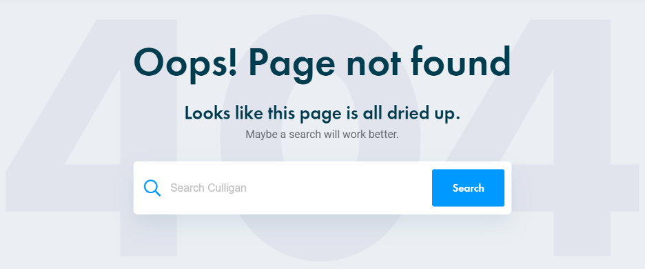
Some brands get fun and clever with the 404 page (like the example below from Culligan Water), which can put a charming spin on an otherwise unpleasant experience for users. Rather than having them reach a dry dead end, you can greet them with a positive message and suggest a next step that will keep them on your site.
There’s stock images and then there’s too stock. If you use the first images that show up for a common, industry-related search term in a popular platform like Getty or Adobe Stock, there’s a good chance those images are already appearing on many other sites not just throughout the web, but within your industry.
If an image from one of your closest competitors’ websites is also on your website, it’s not a good look. It can make your users think you’re lazy or worst of all, it can cause them to confuse you with one of your arch-nemeses.
If you’re going to rely on stock imagery for your site, take the time to select high-quality, on-brand images that are a bit deeper into search results and thus less likely to be seen anywhere else.
Succeeding online comes down to two things: having the right strategies and having the right people to execute those strategies. Perrill has both. We are a full-service digital agency that knows how to win – and we’ve been doing so for over 25 years. As a full-service web development and design agency in Minneapolis, we power our clients’ businesses online through a balanced approach of data and creative, working with you and with each other to build a platform that can catapult you toward lasting growth.
Let’s get started.

